Objective
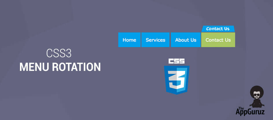
Main objective of this post is to give you How to use CSS 3 in Menu Rotation
Step 1 Introduction
Today lets make a cool CSS 3 menu bar which can make your website look awesome and distinct from other websites out there. So, without wasting much time lets get started !
Using these 3 basic properties you can create create a menu which you can see below:
- transform
- transition
- transform-style
Step 2 Create Basic HTML
In the first step first of all lets create a simple basic html
<body>
<div>
<ul> <li><a href="#">Home</a></li> ... </ul>
</div>
</body>
Step 3 Giving one 'span' tag in to 'li' tag
- For the animation, give one span tag in to li tag.
- Now in that span class add two span tags one fore front side animation and one fore back side animation.
- Give the class in all tag.
<body>
<div class="menu">
<ul class="menu-list"><li><a href="#" class="hyper-link">Home
<span class="box-animation">
<span class="front">Home</span>
<span class="back">Home</span>
</span>
</a></li> ... </ul>
</div>
</body>
Step 4 Apply Simple CSS
Now lets apply simple CSS for that menu.
.menu-list { display:block; background:#eee;}
.menu-list li { display:inline-block; }
.menu-list li a {color:#eee; display: block; text-decoration: none;  font-size:16px; padding:15px; font-family:Josefin Sans,sans-serif;}
Step 5 Apply CSS to all 4 Classes
Lets apply CSS to all the 4 classes we have created.
- hyper-link
- box-animation
- front
- back
.hyper-link{ transition: all .07s linear; position: relative;}
.box-animation {transition: all .3s ease-out; position: absolute; }
.front{ position: absolute; }
.back{ position: absolute; }
Step 6 Apply Animation on Mouse Hover
Now lets apply animation which comes on mouse hover.
.hyper-link:hover .box-animation{transform: translateZ(-5px) rotateX(90deg);}
Step 7 Apply Transform Property on classes
Now lets apply transform property on the following three classes:
- box-animation
- front
- back
.box-animation{  transition: all .3s ease-out; position: absolute; transform:translatez(-25px); transform-style:preserve-3d; }
.front{ transform: rotatex(0deg) translatez(35px);  position: absolute; }
.back{ transform: rotatex(-90deg) translatez(25px); position: absolute; }
Step 8 Apply other basic CSS
.box-animation{transition:all .3s ease-out; position:absolute;  transform:translatez(-25px); transform-style:preserve-3d; top:0; left:0; display:block; width:100%; height:100%;}
.front{transform:rotatex(0deg) translatez(35px); position:absolute; display:block; width:100%; height:100%;  top:0; left:0; background:#07a0e7; padding:15px; color:white; box-sizing: border-box;}
.back{transform:rotatex(-90deg) translatez(25px); position:absolute; display:block; width:100%; height:100%;  top:0; left:0; background:#a9c468; padding:15px; color:white; box-sizing: border-box;}
- You can use this pretty interesting animation in any menu bar you create for your website.
- You can also make changes in the animation and make your custom animations.
- Change these three properties to create various cool effects for your menu bar
- angle
- axis
- animation style(preserve-3d and flat)
Note
You have to add following two properties to make this menu bar compatible to all the browsers:
- -ms (for Internet Explorer)
- -o (for Opera)
- -moz (for Mozilla)
- -webkit (for Chrome and Safari)
I hope you found this blog helpful while creating CSS 3 Menu Rotation. Let me know if you have any questions or concerns regarding CSS 3 or HTML 5, please put a comment here and we will get back to you ASAP.
Got an Idea of Web Development? What are you still waiting for? Contact us now and see the Idea live soon. Our company has been named as one of the best Web Development Company in India.

As a Web Designer I designed the most attractive websites with use of working on a HTML 5 and CSS 3. I love to write & share tips & tricks about latest Web Design techniques.
ASP.NET MVC 5 at a Glance with New Features
HTML5 Tutorial: SVG Shape Morphing