Objective
This blog post is for the beginners or novice in Unity 4.6 to make them familiar with new UI System in Unity 4.6.
Step 1 Introduction
Unity is one of the best game development engines and it is preferred by most of the developers because of its great UI system and cross platform support.
The old GUI system was a little bit incommodious for developers because it supported a few elements and programmers had to write them in OnGUI and sometimes to make the addictive UI, programmer had to use external plugin (like NGUI). And it’s not preferable when programmers have to pay money for it.
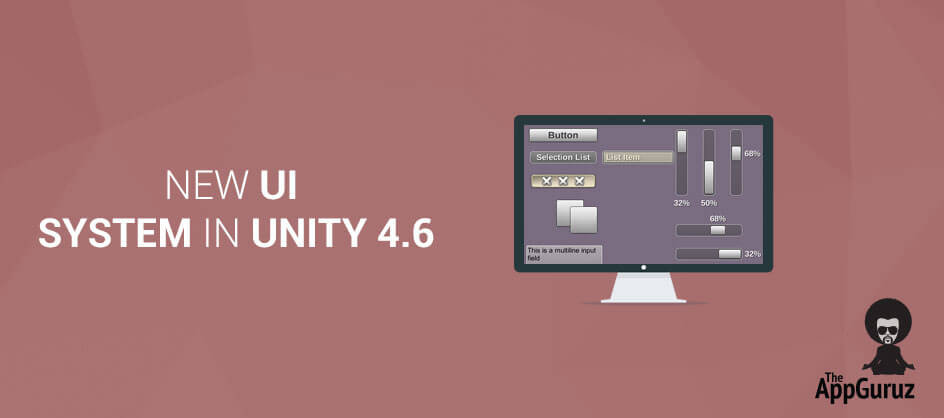
To overcome all these things and to make the UI development enjoyable, Unity has supported new UI system in Unity 4.6 and introduced new UI elements like UI Panel, UI Button, UI Text, UI Image, UI RawImage, UI Slider, UI Scrollbar, UI Toggle, UI Inputfield, UI Canvas, UI EventSystem. We will take overview of these elements in this blog.
Step 2 UI Canvas
Canvas is the parent or root object of all other UI elements or we can say that other UI elements must be the children of Canvas. So, whenever a new UI element is created, Canvas is automatically created and placed as the parent object of it. Canvas is the area or space within which all UI elements are rendered. It supports different render modes. There are many other canvas components like CanvasScaler, CanvasGroup and CanvasRenderer.
Step 3 CanvasScaler
is used to control the overall scale of Canvas which affects to all UI elements within that Canvas. CanvasGroup is used to modify children Alpha, Raycasting, Enable state. CanvasRenderer component renders all graphical UI elements contained within that Canvas after normal rendering has completed. It has no property, only a few methods are available.

Step 4 RectTransform
RectTransform is inherited from Transform component which is basically used for 2D UI elements. It is used to define the position, anchoring, rotation and scale of the object.

Step 5 UI Button
The Button component is used initiate an action when user clicks on it (For ex. Play, Replay, Back, Ok, Cancel buttons in game).UI Button has some properties,

| Interactable | Is this component enabled or accept input or not? |
| Transition | It defines the way how button will be displayed in different phases. There are three different transition options Color Tint, Sprite Swap and Animation. |
| Navigation | It refers to how the navigation of UI elements in play mode will be controlled. There are four different ways for navigation Horizontal, Vertical, Automatic and Explicit. |
Step 6 UI Text
UIText is a non-interactive component which is used to display text. Generally it is used to display information in text, label, caption etc.

UIText component has several properties which are very familiar,
| Text | The text which is displayed by the component. |
| Font | Sets the type of font. Font Style: Defines style of text i.e. Normal, Bold, Italic and BoldAndItalic. |
| Font Size | Sets the size of text. |
| Line Spacing | Sets vertical space between two lines. |
| RichText | Is the text to be interpreted as RichText or not? |
| Alignment | Sets horizontal and vertical alignment of the text. |
| Horizontal Overflow | This method is used when text extends horizontally in rectangle than rectangle width. Its options are Wrap and Overflow. |
| Vertical Overflow | This method is used when wrapped text extends vertically than rectangle height and cannot fit properly in rectangle. Its options are Truncate and Overflow. |
| Best Fit | Should Unity ignore the size properties and simply try to fit the text to the control’s rectangle? |
| Color | Sets color of text. |
| Material | Defines the material used to render the text. |
Step 7 UI Image
UI Image is a non-interactive component which is used to display image. It requires its texture to be sprite.

UI Image has several properties; some of them can be defined at design time,
| Source Image | Defines the sprite which is used to display. |
| Color | The color to apply to the image. |
| Material | Defines the material which is used to render the image. |
| Preserve Aspect | Will image keep original proportion of height and width or will be rescaled? |
| SetNativeSize | Sets the dimension of image box to the original pixel size of texture. |
Step 8 UI RawImage
UI Image is a non-interactive component similar to UI Image which is used to display image, though it can display any texture.

UI Image has some properties:
| Texture | Defines texture which is used to display. |
| Color | Sets the color which is applied to the texture. |
| Material | Defines the material which is used to render the image. |
| UV Rect | It specifies the offset and size of the image. |
Step 9 UI Slider
UI Slider component is used to select the value from given range by dragging the mouse or on swipe.


| Interactable | Is this component is interactable/enabled or not? Transition: It defines the way how component responds visually to user actions. There are three different transition options Color Tint, Sprite Swap and Animation. |
| Navigation | It refers to how the navigation of UI elements in play mode will be controlled. There are four different ways for navigation Horizontal, Vertical, Automatic and Explicit. |
| Visualize | By clicking on this button, it shows navigation flow. |
| Fill Rect | The graphic used to fill area of the control. |
| Handle Rect | The graphic used for sliding handle part of the component. |
| Direction | Defines the direction of Slider in which the Slider’s value will increase when handle is dragged. There are four options for directions Left To Right, Right To Left, Bottom To Top and Top To Bottom. |
| Min Value | Lowest value of slider. |
| Max Value | Highest value of slider. |
| Whole Numbers | Will slider display integer value or not. |
| Value | Current value of Slider. |
Step 10 UI Scrollbar
UI Scrollbar is used to scroll the screen or any particular area where whole content cannot be included. It can be scrolled by dragging the mouse or on swip

Some properties of UI Scrollbar,
Interactable: Is this component is interactable/enabled or not?
Transition: It defines the way how component responds visually to user actions. There are three different transition options Color Tint, Sprite Swap and Animation.
Navigation: It refers to how the navigation of UI elements in play mode will be controlled. There are four different ways for navigation Horizontal, Vertical, Automatic and Explicit.
Visualize: By clicking on this button, it shows navigation flow.
Handle Rect: The graphic used for scrolling handle part of the component.
Direction: Defines the direction of Scrollbar in which the Scrollbar’s value will increase when handle is dragged. There are four options for directions Left To Right, Right To Left, Bottom To Top and Top To Bottom.
Value: Current value of Scrollbar.
Size: Defines the size of Scrollbar’s handle from 0 to 1.
Number Of Steps: The number of distinct scroll positions allowed by Scrollbar.
Step 11 UI Toggle
UI Toggle button is used to select the value from on and off or true and false. It’s a checkbox type component.

UI Toggle has following properties,
Interactable: Is this component is interactable/enabled or not?
Transition: It defines the way how component responds visually to user actions. There are three different transition options Color Tint, Sprite Swap and Animation.
Navigation: It refers to how the navigation of UI elements in play mode will be controlled. There are four different ways for navigation Horizontal, Vertical, Automatic and Explicit.
Visualize: By clicking on this button, it shows navigation flow.
Is On: Initial value of Toggle i.e. true or false.
Toggle Transition: Defines the way how Toggle will react when its value is changed. The options are None and Fade.
Graphic: Defines the image which is used for checkmark. Group: Refers to toggle group to which this toggle belongs.
Step 12 UI InputField
UI InputField is an interactive Text component which is used to take input from user.

Some properties of UI InputField are as follow,
Interactable: Is this component is interactable/enabled or not?
Transition: It defines the way how component responds visually to user actions. There are three different transition options Color Tint, Sprite Swap and Animation.
Navigation: It refers to how the navigation of UI elements in play mode will be controlled. There are four different ways for navigation Horizontal, Vertical, Automatic and Explicit.
Visualize: By clicking on this button, it shows navigation flow.
Text Component: Reference of the Text element. Text: Refers the text which is displayed by this component.
Character Limit: Sets the maximum number of characters that can be input by user.
Content Type: It is used to define the constraint for input text.
Line Type: Defines the line type. Options are Single Line, Multi Line Submit and Multi Line Newline.
Caret Blink Rate: Sets the speed of caret blinking.
Selection Color: Defines the background color of selected text.
Step 13 UI EventSystem
The UI EventSystem is responsible for Raycasting, events and processing and handling input within a Unity scene. UI elements require the EventSystem for Raycasting, handling the input and sending the events, so it is automatically added when new UI element is created.
I hope you find this blog very helpful while working with New UI System in Unity 4.6. Let me know in comment if you have any questions regarding New UI system in Unity. I will reply you ASAP.
Got an Idea of Game Development? What are you still waiting for? Contact us now and see the Idea live soon. Our company has been named as one of the best Game Development Company in India.

I am professional Game Developer, developing games in cocos2d(for iOS) and unity(for all platforms). Games are my passion and I aim to create addictive, high quality games. I have been working in this field since 1 year.
Button Click Effect in UNITY 4.6 UI Using Scripting
Vertical TextView With Shadow Effect